Windows Phone 10 - First Impressions
By: Alan Parr | #Windows10Mobile
After running the Windows 10 Technical Preview on my laptop for the last few months and being generally happy with it, bar the obvious problems you get running a Technical Preview, I’ve been itching to get my hands on Windows Phone 10 (officially referred to as Windows 10 Mobile, but I’m going to refer to it as WP10). As a very happy owner of a Lumia 1020, I’ll be getting it eventually so thought it was worth taking a look at. Fortunately, a colleague has recently switched from WP to Apple, so he kindly leant me his Lumia 635 to use as a sacrifice to the Technical Preview gods. You don’t want to apply this to your main phone. I haven’t hit any bugs yet, but the many interaction problems mean I’d be really annoyed if I had installed this on my main phone.
The Good
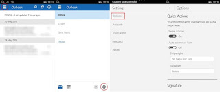
The settings app is vastly improved over the one on WP8.1, which is essentially a load of very narrowly scoped categories in a really long list on the page. The new app is well thought out, and the categorisations seem to broadly match those on Windows 10 on the desktop, which means you experience with one should transfer pretty well to the other.
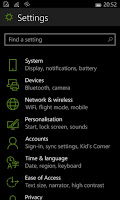
The quick access to commonly used settings that has appeared in the notifications flyout on Windows 10 is also present here. It’s a welcome addition that should reduce the need to venture in to the Settings app.
The Bad
Yes, that good section whizzed by rather fast didn’t it? While I generally like Windows 10, even though it does remove some of the minor features of Windows 8.1 that I quite like, WP10 takes this a step further and removes pretty much everything I like about WP in one fell swoop. Let’s go through the list shall we?
Command placement
WP was very predictable, all commands were at the bottom of the screen, easily reached by your thumb to summon them up. They were large and full width, so you could easily trigger them with the hand that is holding the phone without too much stretching. The overall one-handed experience with WP8.1 is very comfortable.
A great deal of the commands seem to have moved to the new “hamburger” menus in WP10, which are situated in the top-left, about as far away from your phone-holding hand as you can get (unless you’re left handed of course).
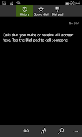
Swiping
As part of their march to look like everyone else, MS have removed the pivot control from their apps. This means that instead of just swiping, again with your phone-holding hand, to move between screens, you now have to stretch
to either the hamburger menu or, in the case of the dialer, to the buttons situated in the middle-top of the screen OR the buttons situated in the middle-bottom of the screen. Add to that, the dialer still has the older ellipsis menu from WP8.1, this one app has about every interaction model available, except for the one that suited it the most. Now I’m sure the ellipsis will go before release, but MS seem to have lost sight of the fact that the Pivot control was one of the greatest things about WP8.1 and I can’t help but think that they could’ve got away with just making it a little smaller to make things more familiar to Android/iOS users while still retaining the superior interaction.
Schizophrenic navigation in the UWP mail app
I’ve noted this separately from the above as I genuinely don’t know whether this is just because this is a TP or if this is how this is actually intended to work, but the interaction with the mail app is incredibly painful and I sincerely hope this is not a sign of what we can expect from the UWP platform. I generally don’t like doing 1-to-1 comparisons against a preview build, but in this case it’s necessary to show how much of backward step this is.
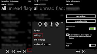
To look at account settings in WP 8 is: Swipe up (or tap ellipsis) to bring up command bar (at the bottom of the screen), tap settings in the resulting menu which appears from the bottom of the screen.
In WP10: Tap hamburger (top-left), cog icon (bottom-right), tap options (in menu that appears from top of screen). My finger is going all over the phone here. It’s quite a stretch and it’s not even a big phone. On my Lumia 1020, I suspect this would be a 2-handed operation.
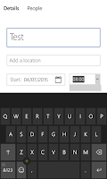
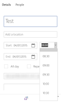
Desktop input controls on a phone
Most of the criticism aimed at Windows 8 is that it uses a phone UI on the desktop. It would appear misplaced UI elements is a two-way street. In the calendar app, and presumably all UWP apps, the dropdowns, rather than being full screen as they have been previously, are dropdowns just as they would be on the desktop. Except now they’ve got to contend with fat fingers and an on-screen keyboard that gives them no vertical height to occupy.
Slow animation on apps view
Now I’m nitpicking a bit, but WP at the moment is a very snappy, fast OS. You can get things done pretty quickly and there are no slow animations getting in your way, everything happens almost instantaneously. Long pressing on the back button to bring up the running apps view triggers in what feels like about 100-200ms and the animation is quick.
On WP10, it feels more like 700-800ms and the animation is slow. I don’t think this is down to the hardware as there is no visible lag, it just seems that they’ve slowed it down to make it smoother. Smooth === slow in this case.
Verdict
Not good. WP has always been a very different beast to other mobile operating systems, maybe this is part of the reason it hasn’t taken off. But, in my view, the interaction with WP is faster, easier, and more natural than interacting with Android or iOS. I haven’t had a great deal of contact with iOS and even less with BlackBerry, but I had Android phones for about 6 years before my current Lumia and while I didn’t hate using them, WP was the first mobile operating system that I can actually describe as being pleasant to use.
While there are a lot less WP users, those who stick with it tend to be much more satisfied with it than users of other operating systems.
In their attempts to try and appeal to Android and iOS users, MS seem to have forgotten the things that make WP so pleasant to use. While I do not blame them at all for trying to make the experience more familiar to users of other OSes so the move doesn’t seem quite so scary to those used to Android or iOS, you’ve got to think of your existing users while trying to appeal to new ones.
I suspect that, if the current preview is anything to go by, WP10 is just going to look like a pale imitation of Android or iOS, and that’s a damn shame.
About Alan Parr

I am a .Net developer based in the Midlands in the UK, working on Azure, .Net Framework, .Net Core, and just generally playing around with anything that interests me. I play snooker (badly), archery (acceptably) and am a recovering Windows Phone user.